< Back to Case Studies

Ortus Business Finance

Ortus Business Finance was born from a passion for helping businesses succeed during difficult financial times by arranging straightforward and fast business loans. In 2020, Ortus approached us to help them update their existing website to represent better who they are and make the brand more accessible on devices. Here's how we did it.

Visit Ortus's Website >

Getting help when you need it shouldn't be complicated.

Business Financing comes in all shapes and sizes, but it can often be a tricky process to get the help you need. Unlike many brokers, Ortus work with a wide variety of partners to help businesses get the right deal for them, regardless of how the markets are moving at the time. Unfortunately, the existing Ortus website no longer reflected their brand and ran on an outdated and insecure version of WordPress. We modernised the Ortus Business Finance website using a variety of UX designs and created new shortcuts that made the application process more straightforward.

WordPress is an excellent Content Management System for this type of business, so we provided them with the latest version. Along with making content changes simple, WordPress allows companies to have greater control over site performance and search engine optimisation.

Creating a friendlier face to Business Financing

During the storyboarding/wireframing process, we worked with local illustrator Steve Roberts to bring a more human approach to Ortus's identity. Steve helped us bring their services to life, creating a range of awesome mascots that we used throughout the site. Ortus now stand out from the sea of repetitive commercial photography used by their competitors.

Designing for the finance industry

After working closely with the Ortus team during the design process, we realised that the new Website needed to reflect the critical parts of the business that their customers loved the most - their friendly, knowledgeable and helpful approach to finance.

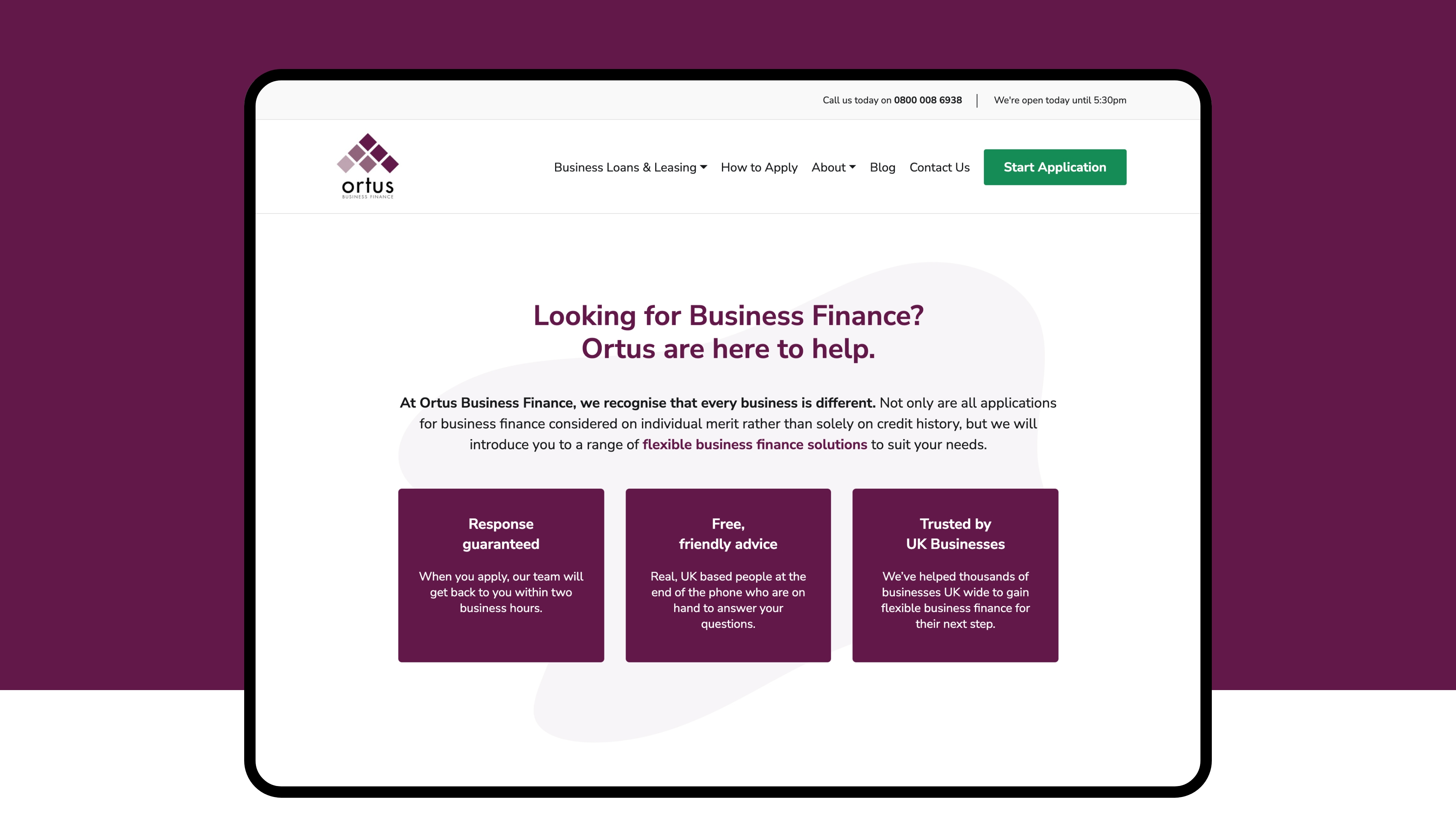
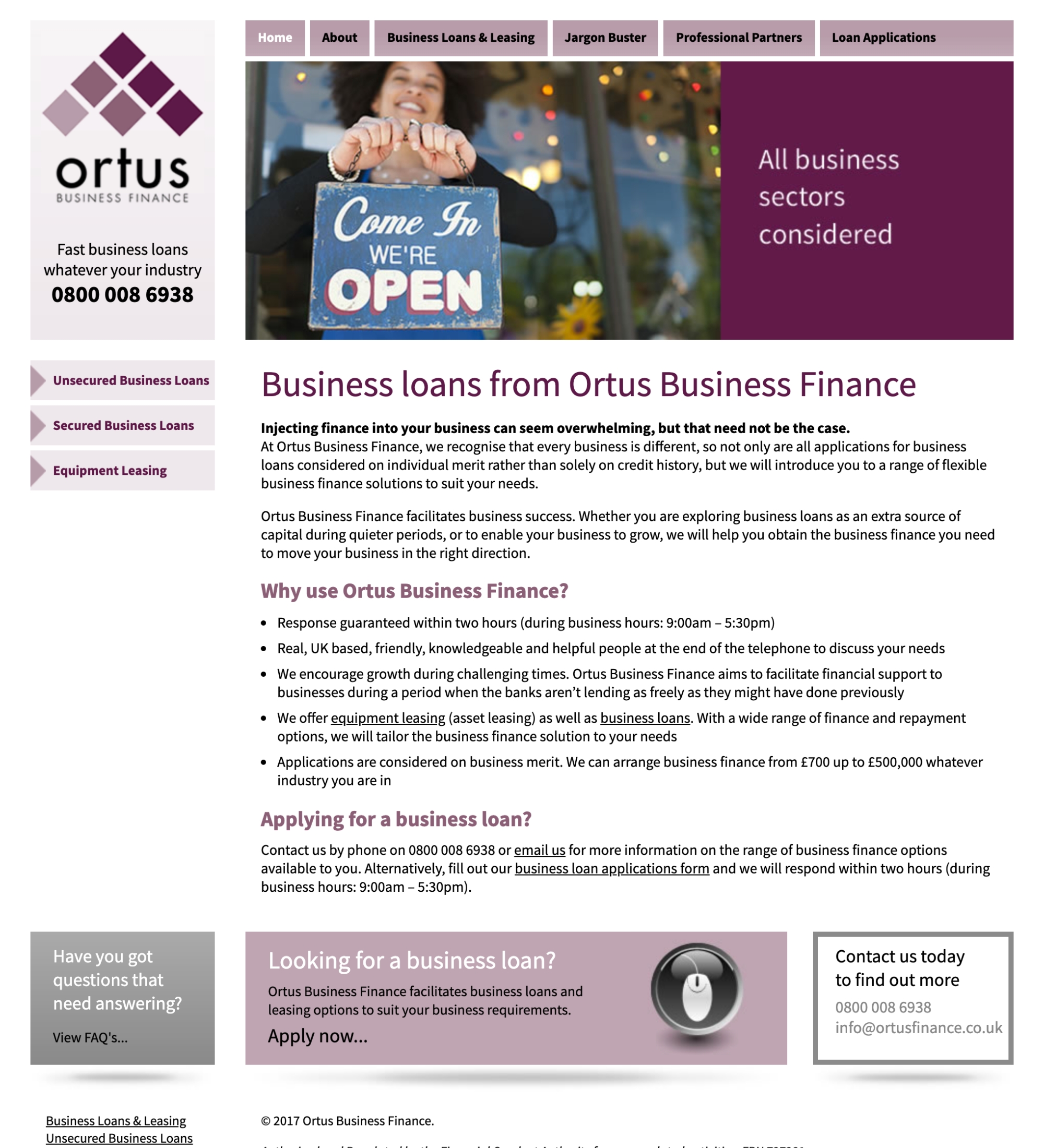
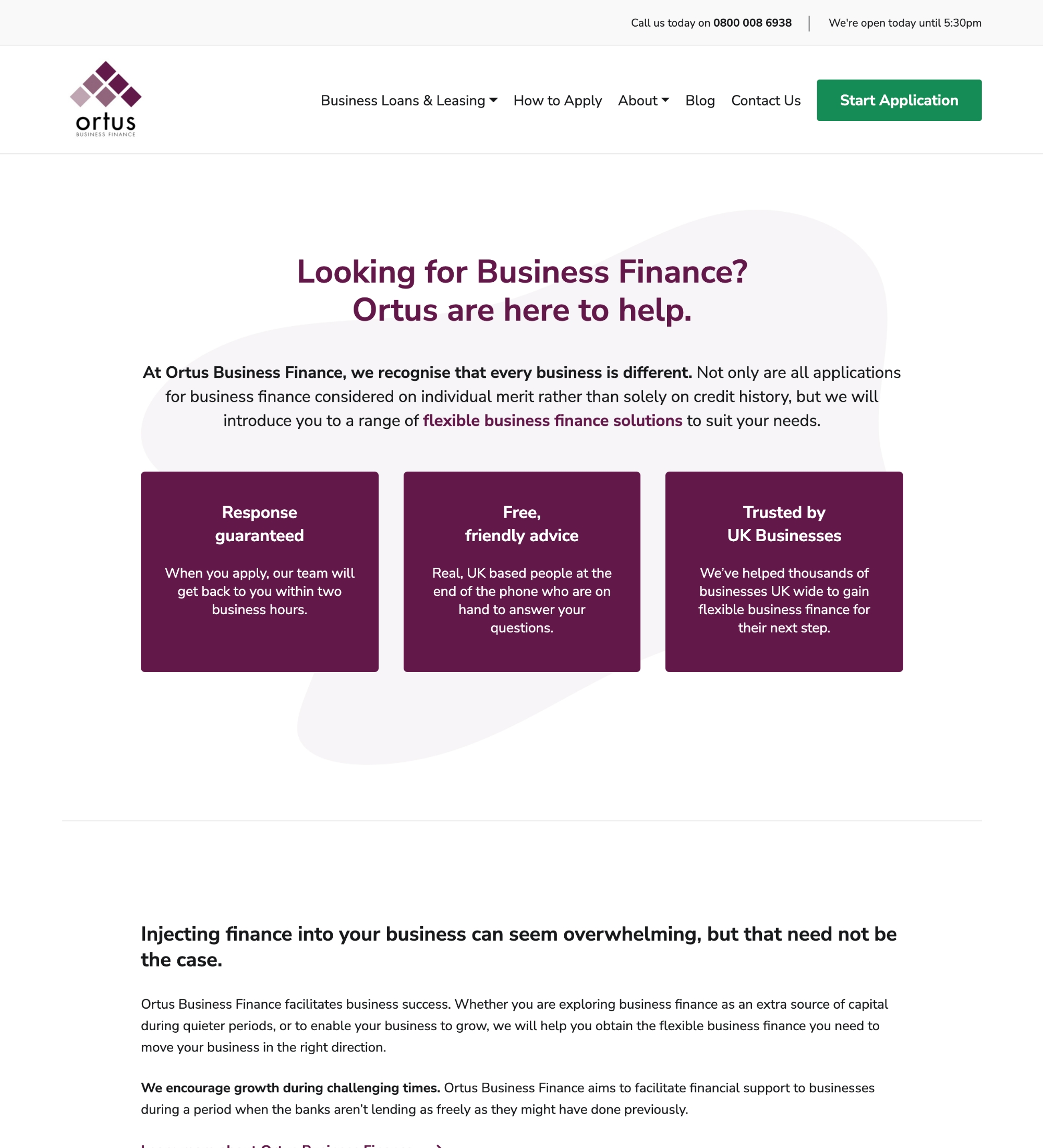
We signposted their services in a clear, straightforward way, helping customers navigate around the Website effortlessly. Along with our new illustrations, the information for each service is broken down into easy-to-read sections, with clean white backgrounds and a clear call to action at the end of each page. Now visitors can easily find the information they need to apply, resulting in a stress-free journey around the site.

A generic square placeholder image with rounded corners in a figure.
Before the facelift.
A generic square placeholder image with rounded corners in a figure.
The new Ortus Business Finance Website.

Simplifying the application process

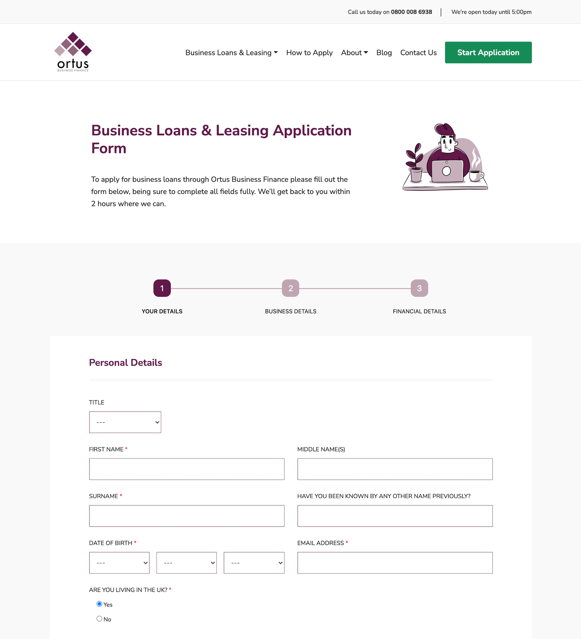
Due to the nature of applying for business finance, long, tedious forms are unavoidable. With some UX design, we made the process much smoother for Ortus's visitors. We broke down their application form into three sections, Applicant Details, Business Details and Financial Details.

Introducing a step marker at the top of the form can help prevent users from feeling overwhelmed or frustrated by the application process. Visitors can now see progress between each step, which makes them more likely to complete the form and convert through an action button at the end.

Results

Ortus Business Finance now has a clean, fresh and manageable online presence. With more qualified leads generated through the Website, Ortus can now help more businesses gain the finance they need to grow their business in these uncertain times.

Let's make something great together!

If you'd like to discuss your next project with us, please feel free to give us a call on 01827 781 311 or press the "Start My Project" button to get in touch for a quick quote.

Start My Project