Designing and building an Autism-friendly Website
1-2% of the UK population is currently affected by Autism, roughly 1 in every 100 children and 2 in every 100 adults. Autism can affect how people perceive their surroundings and interact with the people around them. Designing with this in mind can be pretty challenging, but there are things that we can do to make the experience more comfortable. Here are some of the key components that we took into consideration whilst designing:
Sensory differences
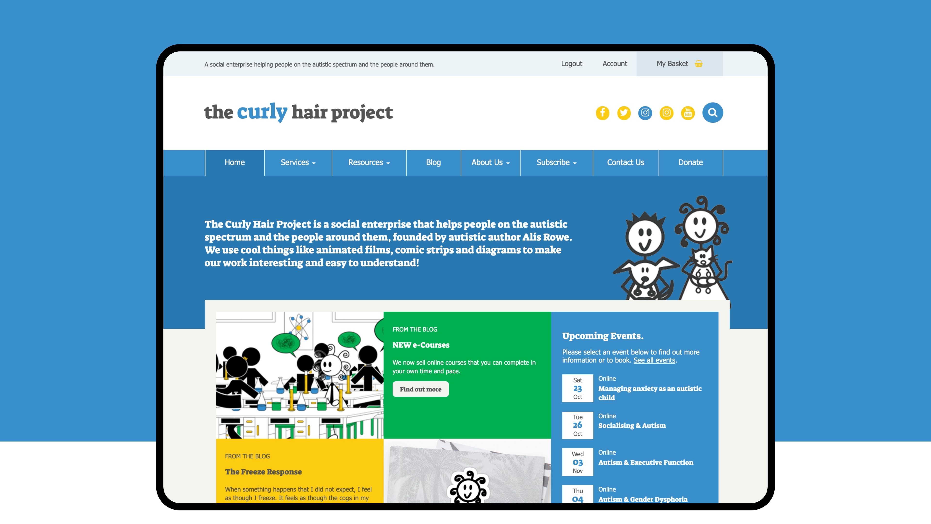
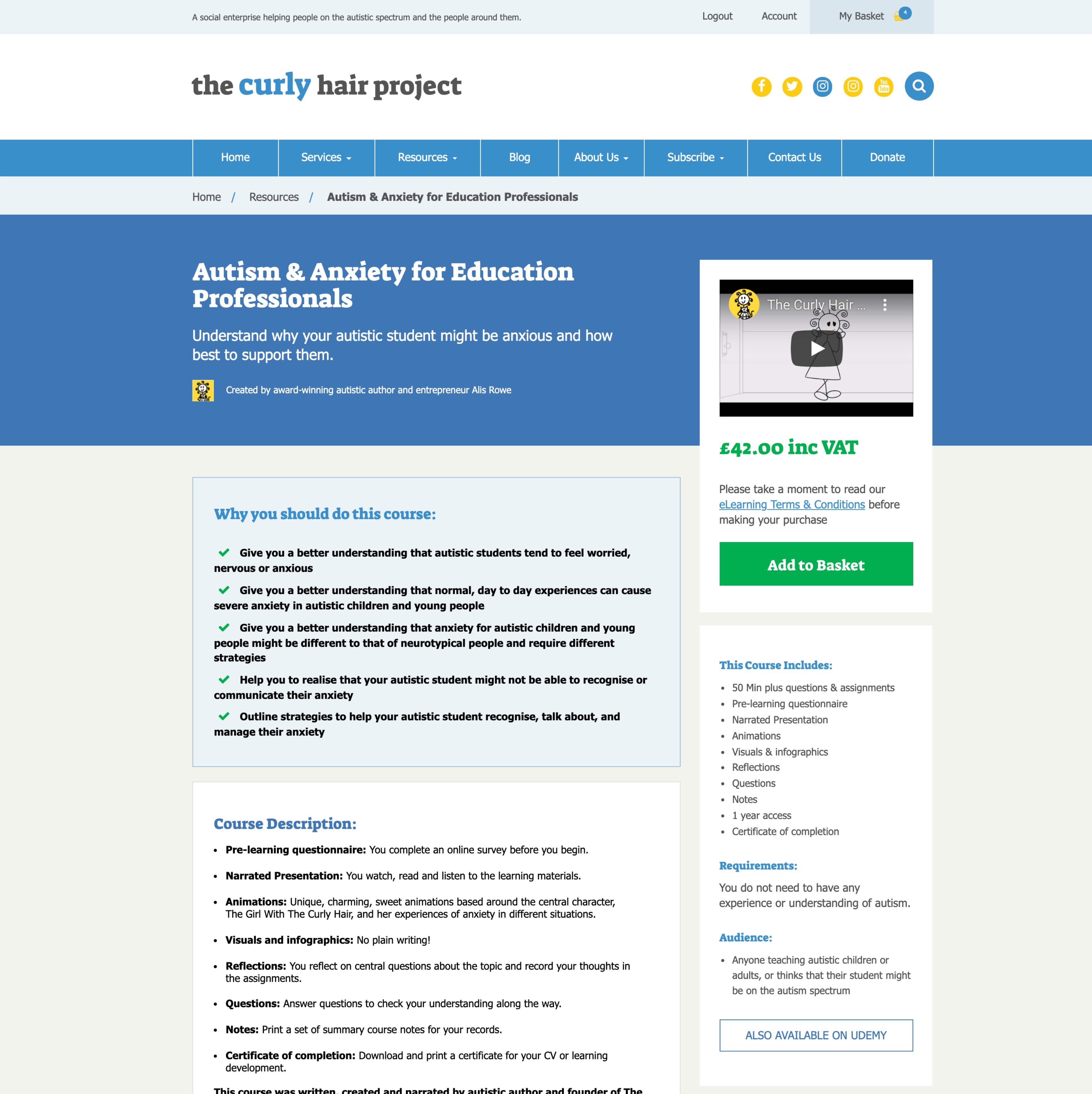
Processing sensory information can be complex for those affected by Autism. Their senses may be under or overstimulated, or both at different times. To help remove these triggers, we kept the redesigned CHP Website simplistic in its design, with plenty of space around objects to help visitors digest the information more easily. The Website does not automatically scroll things like banner spaces or rolling text; this allows users to control what objects they move around the site. We have also prevented videos throughout the animations area from auto-playing.
Another area of design that can support those with sensory differences is the choice of fonts and the size they display across the Website. In the 2018 Survey of Autism Spectrum Disorder Friendly Websites Whitepaper, they recommend using a clear font family (in our case, we continued using Tahoma as this is CHP's brand font), with a different font for headings. Using clear Sans-Serif fonts is helpful for other health conditions, too, such as Dyslexia.
Communication
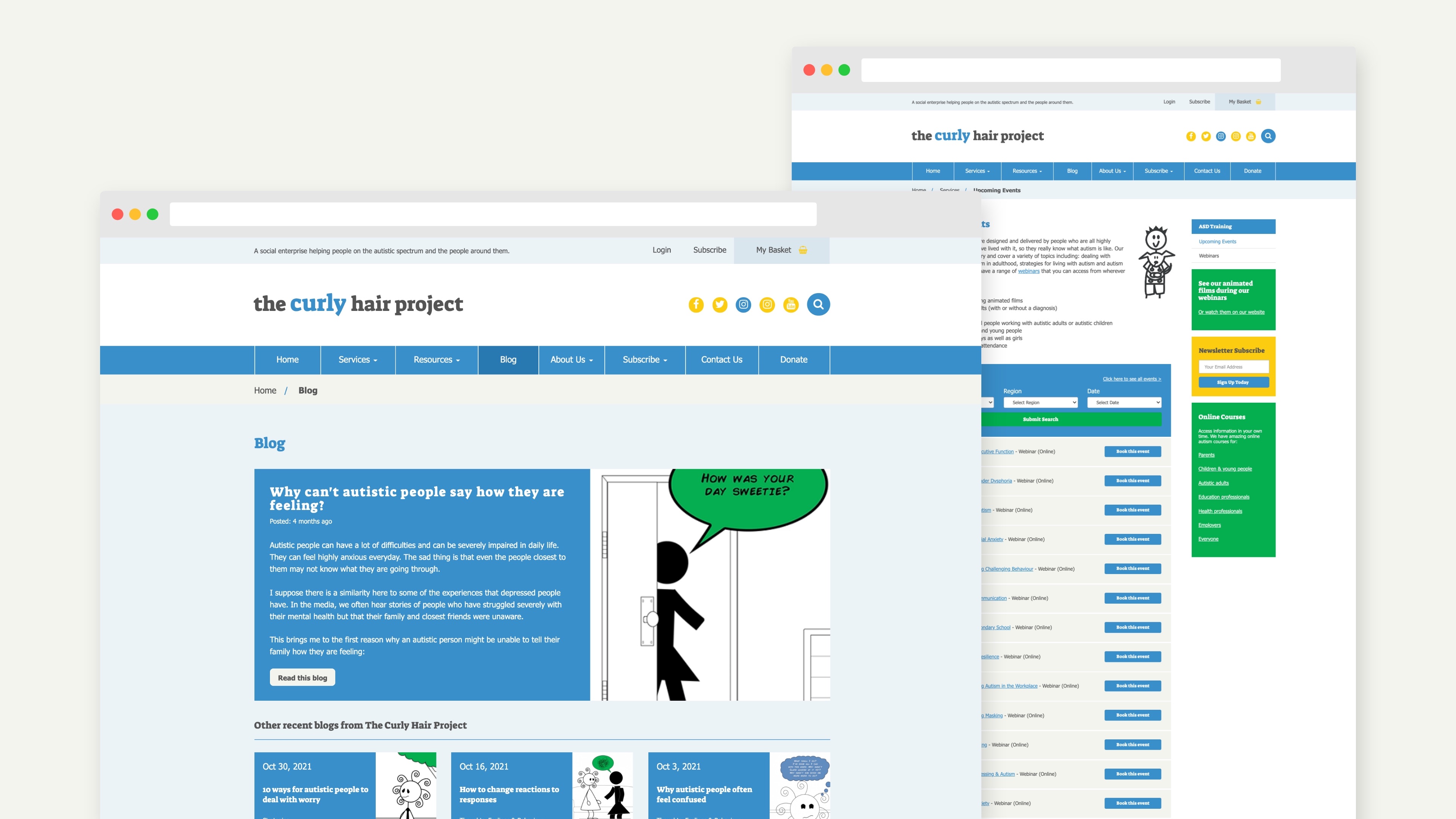
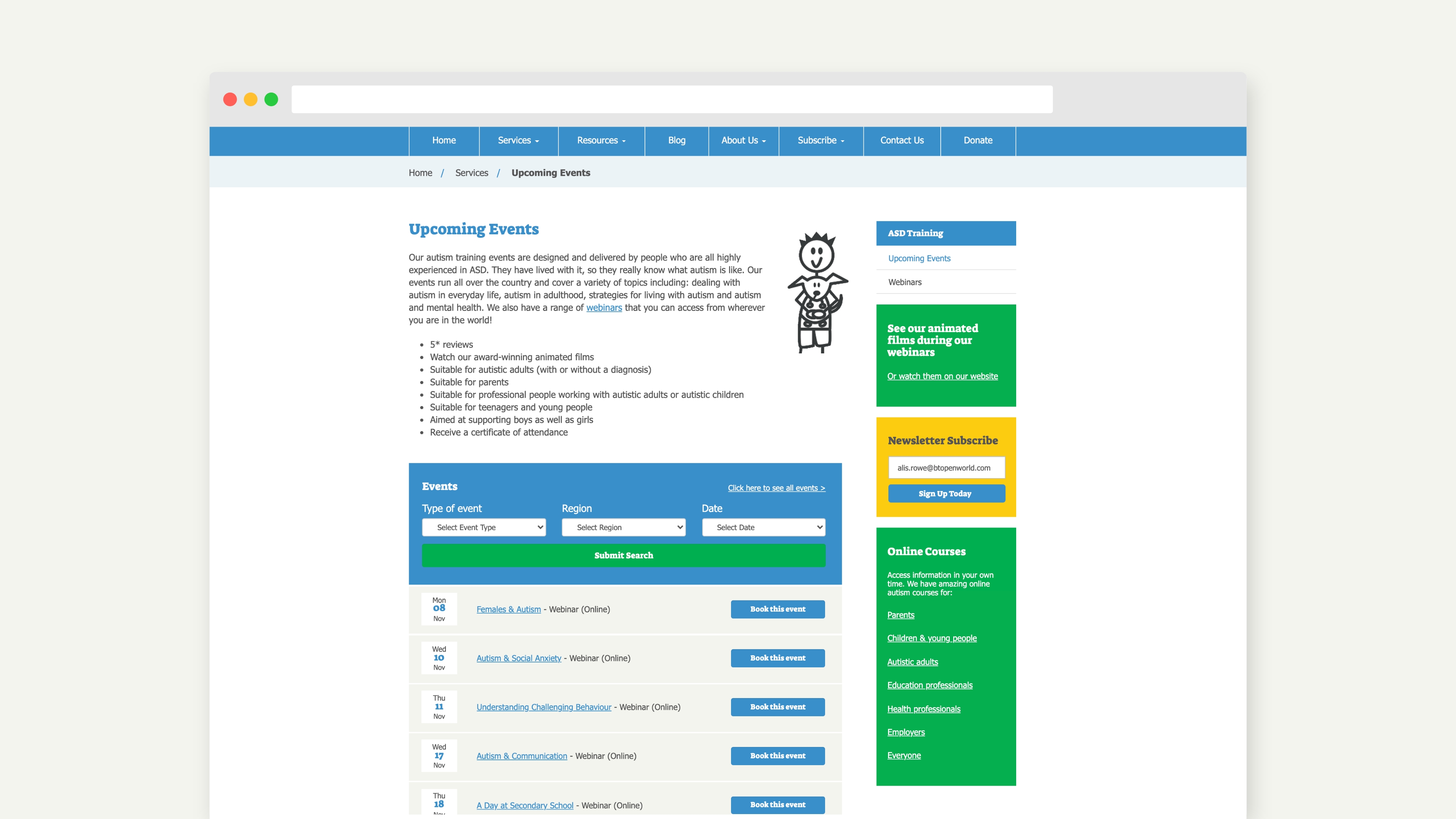
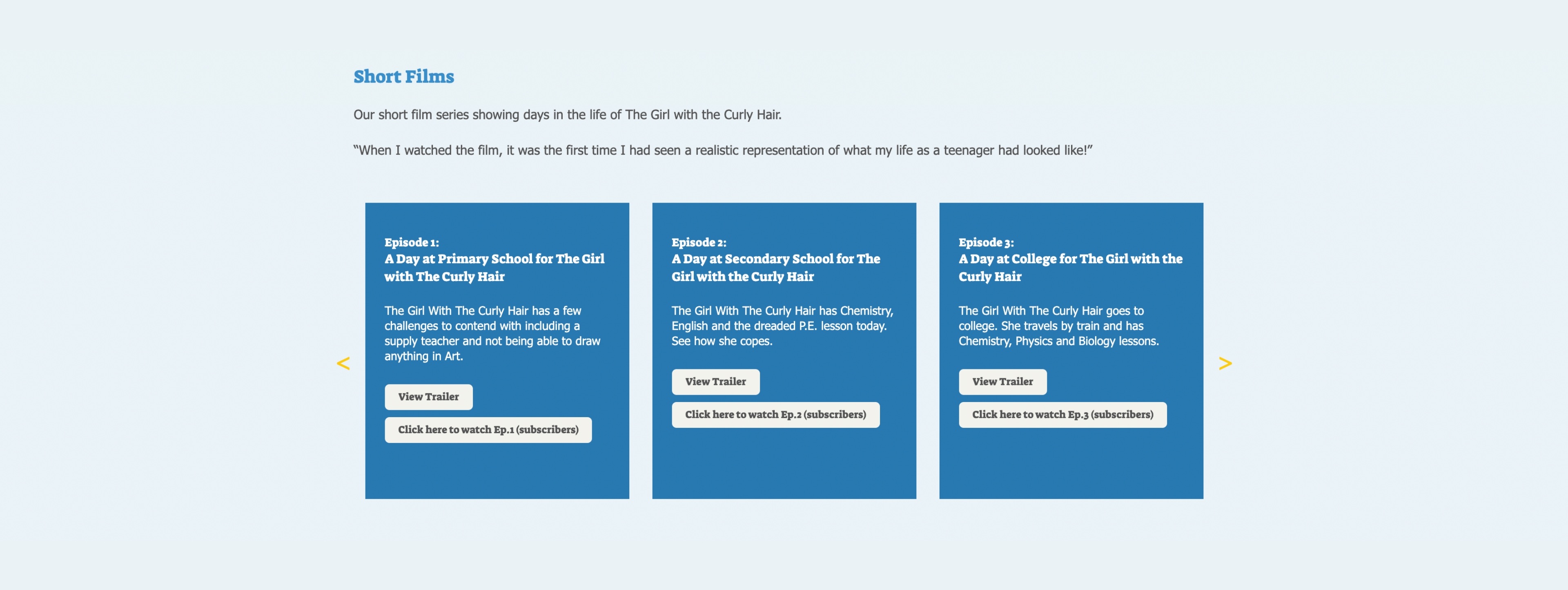
Just like sensory information, those with Autism may communicate much differently to neurotypical people. Content is best when it is direct in tone, structured and presented clearly. Alis uses visual supports throughout the site, like short videos and illustrations, which helps create a deeper understanding of the content. So, how do we communicate clearly? Using more significant heading text, lists and following a set pattern to every page helps. It's also important to be very clear with your visitors on interacting with items like buttons. Instead of using generic labels like "Click Here" or "View more", you can use descriptions such as "Attach Files", "Click here to download", "View PDF Document".
Consistency
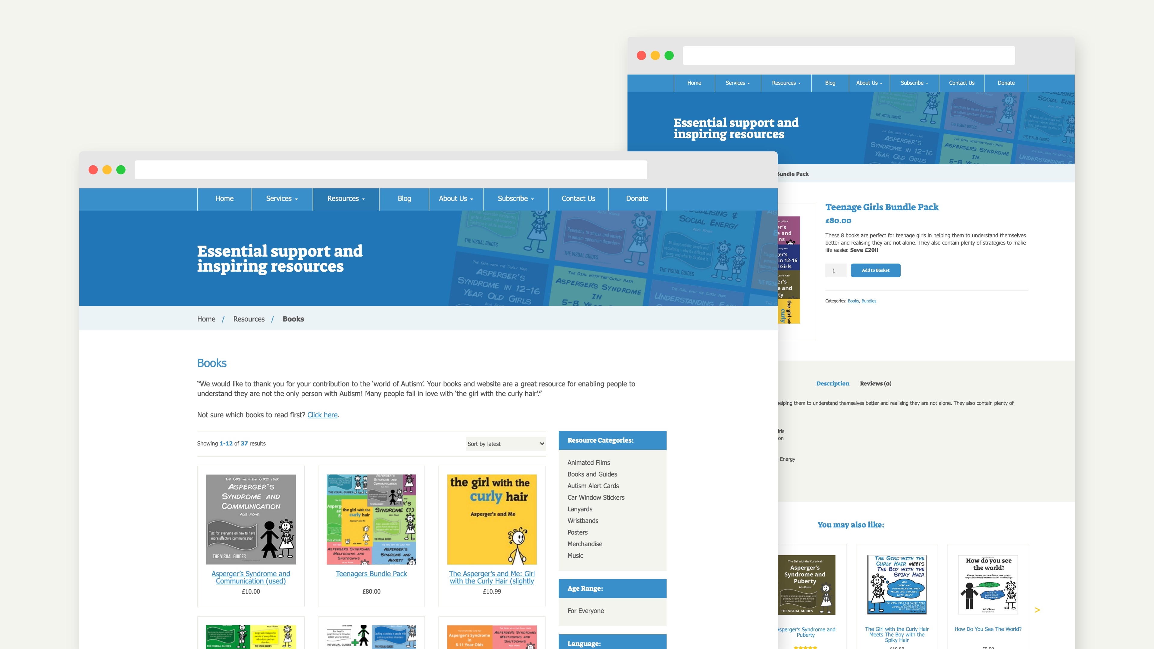
Building consistent and straightforward layouts is another excellent way to support users as they move around the Website. We designed the CHP Website to have static navigation throughout the Website; the sidebars also use the same layouts to make it easier for users to click through different pages. Links on your Website should also be the same colour throughout, and obvious that they are clickable links.
The Curly Hair Project is a resource for everybody, whether a parent, teacher, health professional or someone on the spectrum. By designing with these objectives in mind, we ensure that people can access the information they need.


